Art truly has the power to transform a space! It affects the space in a profound way, so when selecting what to hang on your walls, make it personal. Art in a home environmen is different that art in general. While art in general should move us, touch our hearts in one way or the other, most people like art that bring out good feelings for their homes. What that is, is as different as there are people. Myself, I tend to like abstract art. To me, there is something soothing about abstract art, even some of the abstract expressionst masters, like Franz Kline or Jackson Pollack, has that effect on me. But there is one artist that I always come back to, and there is nobody like him; Henri Matisse. Matisse was the master of color and shape, and I think I like absolutely everything he did! Here are some of my favorites.
Sunday, October 11, 2009
Thursday, September 3, 2009
Wow, look at Erin Adams glass tiles for Ann Sachs! I absolutely LOVE this. Erin Adams is a glass mosaic artist, and her glass tile designs are sold through Ann Sachs. Her designs varies from very modern and graphic, to soft florals. It is just beautiful! These are three of my favorites.
Look at their website for more patterns: http://www.annsacks.com/onlinecatalog/program.jsp?cat=268004&coll=268304&prg=1365904
Saturday, August 29, 2009
Patio furniture
How does it come that patio furniture is so unattractive? I live in Phoenix, and we spend half the year outside, I need some nice looking outdoor furniture! One of the few places I have found that sell stylish patio furniture is Restoration Hardware. Right now they have a sale, guess who is tempted...?
Sunday, August 23, 2009
What is your color personality?
What is your color personality? Mine is blue. For my own home, I love to decorate with different hues of blue - from pale, pale airy blue to intense midnight blue, almost black.
Here is also another bedroom with airy blues, could have been my own, but is designed by Phoebe Howard (photo from House Beautiful).
Saturday, August 22, 2009
Color is a powerful tool
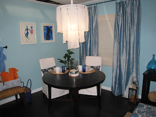
Color is a powerful tool! Pick the right colors, and you will love your room. Pick the wrong ones, and the opposite will happen. Look at these two pictures. The bottom one is a dining room before colors on the walls, the top is after.
Here are my 6 top advice for finding a color scheme that works for you:
1. Think about your favorite color in general
Take some time to think about what colors that generally makes you feel good. Look at what colors you like to wear. You can even think about what type of landscape and season that inspires you. For example, if you usually dress in neutrals and black, your favorite vacation is a week on the beach, and summertime is your favorite season, most likely you will feel good in a room filled with light sandy neutrals dressed up with blues and greens or maybe yellow.
2. Find a main color.
When you have reflected over your favorite colors, the next step is to find the main color for the home. My recommendation is usually to make this color a neutral. Neutral does not only mean beiges or tans, but can be a neutral yellow, green, or something else that you like. This color is the color that will be repeated throughout hallways and will also usually be used in some of the main rooms, such as the family room and/or dining and living rooms.
3. Use the color wheel.
The color wheel provides for many different color schemes, but these two are the easiest to work with: Complementary color scheme, which uses colors that are across from each other on the color wheel. Examples of these color schemes are blue and orange, green and red, or yellow and purple. Generally speaking, the complementary color scheme works best in formal areas of a house.
The other one is the analogous color scheme, which uses colors that are right next to each other on the color wheel, such as yellow and green, blue and green, or red and orange. This color scheme works best in the more private spaces, such as family rooms and bedrooms.
4. Colorize vertically.
It almost always works to decorate a room from dark to light vertically. Using this method, the floor will be darkest, and going up, the colors should get lighter. Think about nature, and how the ground has the darker values, the trees has the medium values, and the sky has the lightest values.
5. Use the 60-30-10 rule.
What this means is that you should use 60% of one color in a room (typically the walls and a little bit more), 30% of another color (typically upholstery and window treatments), and 10% of an accent color. Try it – it works!
6. Always use some black.
This is so easy, and it really works! By always adding something black to a room all the other colors will be enhanced. The room will feel more elegant and defined.
Sunday, August 9, 2009
My son's room - inspiration picture
My daughter got a new room for her 6th birthday. It is very pink, and she loves it! Now the time has come to my son. His 9th birthday is coming up in about two months, and I have started to plan his new room. He likes orange, bold graphic prints, theatre, tan, maybe a little bit blue... He wants a more grownup room.
My Top Five's - August 2009
Blues in every hue
Bold batik patterns
Lots of texture
Splashes of green
Easy, breezy living
Subscribe to:
Posts (Atom)